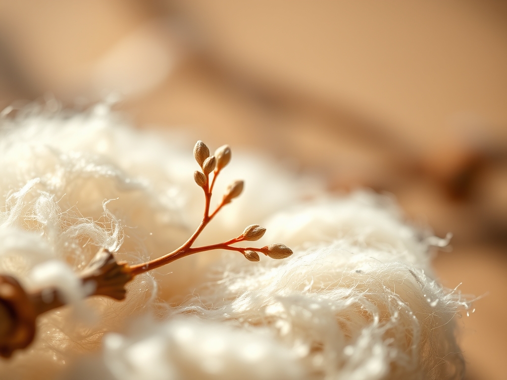
Close your eyes and feel the tooth of that heavy cold press paper under your fingertips. It is not just a surface; it is a landscape of cotton fibers waiting to drink. When you start your Intro to Botanical Illustration, you are not just drawing; you are performing a delicate surgery on light and form. The air in the studio smells like cedar shavings and damp earth. You can feel the weight of the metal drafting pencil in your hand, a perfect ergonomic balance that promises precision. We are diving into the grit of the garden, where the tensile strength of a stem meets the translucent glow of a petal. This is about more than "pretty pictures." It is about understanding the cellular architecture of your backyard. We are going to dissect the visual world with the soul of an artist and the brain of a physicist. Grab your magnifying glass; we are going into the weeds to find the masterpiece hidden in the veins of a leaf.
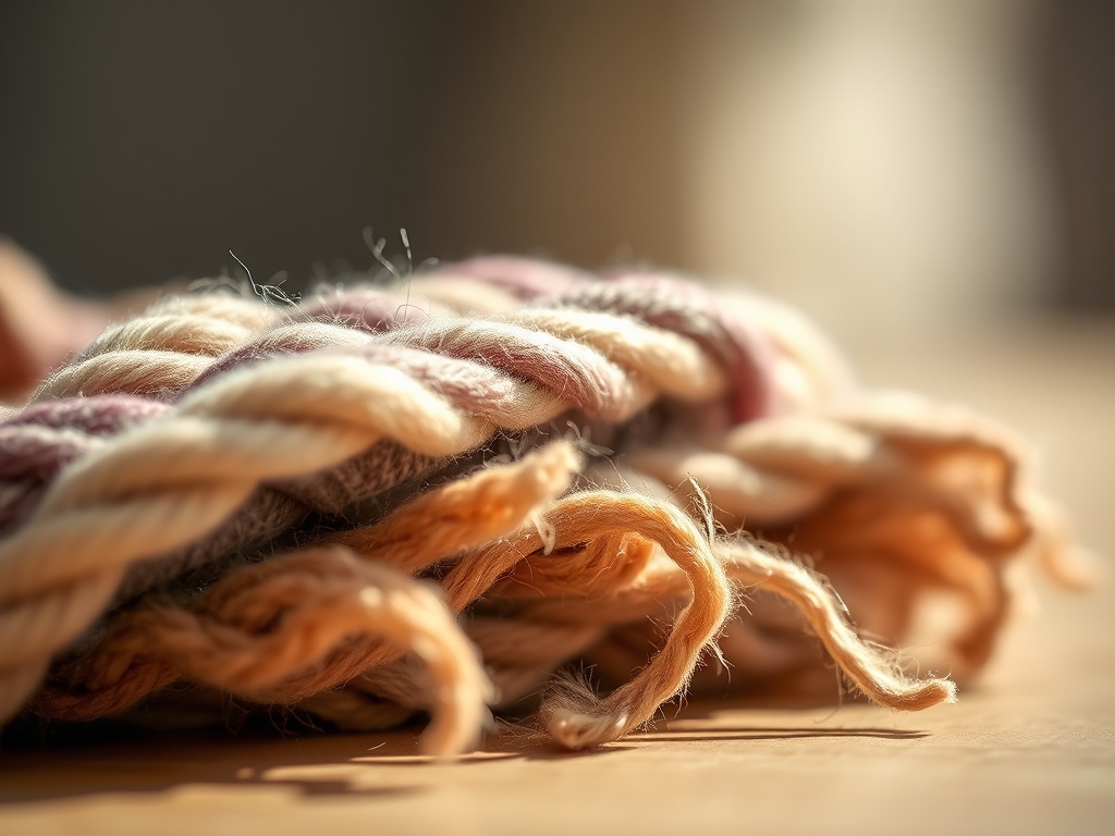
THE STUDIO KIT
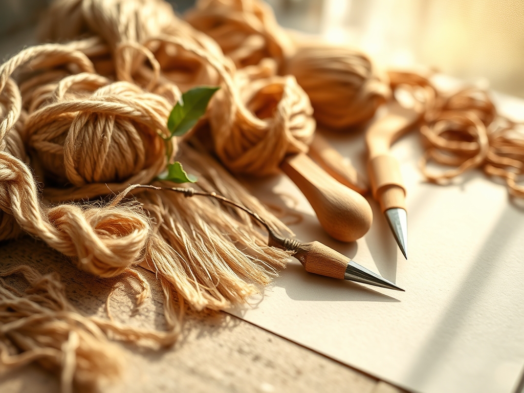
THE STUDIO KIT
To master an Intro to Botanical Illustration, your kit must be as precise as a laboratory. You need 300gsm cold press watercolor paper, which offers a porous texture that allows for multi layered glazing without warping. For the skeletal structure, use graphite pencils ranging from 2H to 4B; the harder lead ensures your initial marks do not smudge into the pigment later. You will also need synthetic sable brushes, specifically rounds in sizes 0, 2, and 4, which maintain a sharp point through high surface tension.
Material Substitutions: If you cannot find high grade cotton paper, a heavy mixed media paper will suffice, though it lacks the same capillary action for smooth washes. Instead of a traditional kneaded eraser, you can use a bit of tacky putty to lift graphite without damaging the paper grain. For those without a professional light box, a bright window serves as a natural backlight for tracing your initial botanical studies onto your final sheet. Always keep a bone folder nearby to crisp your paper edges and a set of calipers to measure the exact diameter of your flower heads.
THE TEMPO
The Maker's Rhythm is a three act play. First is the Observation Phase, which takes roughly sixty minutes of intense staring and sketching. You are looking for the geometric logic of the plant. Next is the Structural Render, a two hour process of laying down the "bones" of your illustration. Finally, the Chromative Layering can take anywhere from five to ten hours depending on the complexity of the bloom. Do not rush the drying time between glazes. If you apply wet paint to a surface that is still even slightly damp, you risk a "bloom" or backrun, where the water tension breaks and ruins your smooth gradient. Respect the evaporation rate of your studio environment.
THE CORE METHOD
1. The Geometry of the Pansy
Start by mapping the five petals of the pansy using a series of overlapping circles. The pansy is a masterclass in overlapping planes. Focus on the central "face" where the petals converge.
Mastery Tip: Use your calipers to ensure the bilateral symmetry of the lower petals. The science here is proportional accuracy; even a millimeter of deviation can make the flower look wilted rather than vibrant.
2. The Tubular Logic of the Foxglove
The foxglove is a vertical spire of bells. Draw the central stalk first, then attach the individual florets. Each bell is a cylinder seen in perspective.
Mastery Tip: Remember that the florets at the bottom are older and larger than the buds at the top. This represents the biological growth cycle, and capturing this transition creates a sense of living movement in your work.
3. The Spiraling Succulent
While not a traditional flower, the Echeveria is essential for learning the Fibonacci sequence in nature. Map the leaves in a spiral starting from the center.
Mastery Tip: Use a 4H pencil for the edges. The thick, waxy cuticle of a succulent requires a sharp, clean line to represent its turgor pressure, which is the internal water pressure that keeps the plant rigid.
4. The Fragile Poppy
Poppies are all about the "crinkle." The petals are paper thin and reflect light in complex ways. Use a very light touch with your graphite.
Mastery Tip: To capture the texture, use a dry brush technique. The friction between the brush bristles and the paper tooth creates a broken line that mimics the delicate, wrinkled surface of the petal.
5. The Structural Rose
A rose is essentially a series of cups nested within each other. Start with a central heart and build the petals outward in a staggered formation.
Mastery Tip: Pay attention to the "turn" of the petal. The structural integrity of a rose petal allows it to curl at the edge. Use a bone folder on a scrap piece of paper to practice visualizing how a flat surface curves into a three dimensional form.
6. The Linear Lavender
Lavender requires a rhythmic application of small, oval shapes along a thin stem. It is a study in repetition and negative space.
Mastery Tip: Leave tiny gaps of white paper between the buds. This utilizes optical mixing, where the viewer's eye fills in the spaces, creating a more luminous and airy effect than a solid block of color.
7. The Radiant Sunflower
The center of a sunflower is a complex grid of seeds. Use a fine liner or a very sharp 2B pencil to map the intersecting spirals.
Mastery Tip: This is a lesson in phyllotaxis, the arrangement of leaves or seeds on a stem. If your spirals do not align, the entire flower will look structurally unsound.
8. The Trumpet Lily
The lily is a masterclass in foreshortening. The petals flare out from a deep central point, requiring you to draw ellipses with confidence.
Mastery Tip: Use a "ghosting" technique. Move your hand in the motion of the curve before actually touching the lead to the paper. This builds muscle memory and ensures a fluid, organic line.
9. The Complex Hydrangea
Do not try to draw every petal. Instead, map the overall sphere and then detail a few "hero" florets in the foreground.
Mastery Tip: This teaches atmospheric perspective. By keeping the background florets soft and out of focus, you create depth. The science of light scattering means that distant objects have less contrast than those in the foreground.
THE TECHNICAL LEDGER
Maintenance & Longevity: To keep your illustrations from yellowing, always use acid free, pH neutral paper. Store your finished pieces in archival sleeves made of polypropylene. Avoid direct sunlight, as UV rays will break down the chemical bonds in your pigments, a process known as photodegradation.
Material Variations: For a sustainable approach, try using hemp or bamboo paper, which has a similar tensile strength to cotton but a lower environmental footprint. If you want a premium feel, vellum provides a non porous surface that allows for incredibly fine detail, though it requires a much steadier hand and longer drying times.
The Correction:
- The Smudge: If you smudge your graphite, do not rub it. Use a battery operated eraser to lift the particles vertically without grinding them into the fibers.
- The Over-Saturation: If a wash is too dark, wait for it to dry completely, then use a damp, stiff "scrubber" brush to gently lift the pigment.
- The Bleed: If colors run together, use a clean, dry brush to act as a "thirsty brush," soaking up the excess moisture through wicking action before it spreads.
Studio Organization: Store your work flat in a map drawer or a heavy portfolio. Never roll your botanical illustrations; this creates mechanical stress on the paper fibers and can cause the pigment layers to crack or flake over time.
THE FINAL REVEAL
Look at that! You have successfully navigated the complex anatomy of the garden. Your Intro to Botanical Illustration project is not just a collection of drawings; it is a technical map of biological beauty. The way the light hits those glazes and the precision of your line work shows a deep understanding of both art and botany. You have captured the soul of the plant through the lens of a maker. It is vibrant, it is accurate, and it is absolutely stunning. Hang it somewhere where the light is consistent, and take a second to appreciate the sheer physics of what you just created. You are officially a botanical boss.
STUDIO QUESTIONS
What is the best paper for botanical art?
High quality 300gsm hot press or cold press cotton paper is ideal. It handles multiple washes without warping and provides the necessary surface tension for detailed watercolor work.
How do I prevent my colors from looking muddy?
Avoid mixing more than three pigments at once. Use transparent glazes and allow each layer to dry completely to maintain color clarity and prevent the physical mixing of wet pigments on the page.
Why do my flower petals look flat?
You likely need more contrast. Use a range of values from deep shadows to bright highlights. Focus on the "turn" of the petal where light transitions into shadow to create three dimensional form.
Can I use regular printer paper for practice?
Printer paper is too thin and lacks the proper sizing for wet media. Use a dedicated sketchbook with at least 150gsm weight to ensure the paper can handle the mechanical stress of erasing and layering.